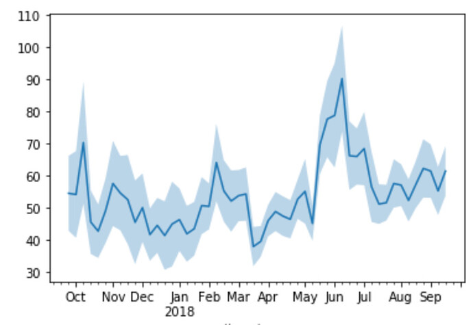
I’d love to see a visualisation where I can fill an area between two specified columns. This is very helpful for showing things like confidence intervals, or to show errors.
The Line Chart has an Errors field which displays error bars, and that’s close, but for charts with a lot of data, it gets unwieldy quite quickly. Instead, I’ve attached a screenshot for what I’d love to see.
Thanks !

