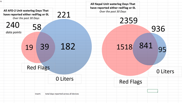
Hi Team! Wow, it would be so useful to be able to make Venn Diagrams.
This is the kind of visualization (size sensitive = the size changes based on the amount of data points in one circle) (color adjustable) that would REALLY help to show relationships between columns and other things. Here is a visual example of what I’d like to see:
Is this possible??

