Take a look at this one.
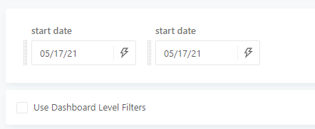
If you have a lot of dashboard parameters and you end up clogging ALL of them on top of the dashboard its confusing which filter applies to which visualization. The example here is only 2, imagine if I have 7 or even 10 parameters and tons of visualization.
Using widget parameter is usable but not efficient, what if I have 10 visualizations with 10 the same parameter, imagine changing that value 10x.
Need a proper way to move these dashboard parameters by certain location not just on top. I want some to be moved in the middle because it may relate to only certain visualization in the middle or some at the bottom, etc.

