So maybe it’s just me, but 2nd y axis is not working with bar charts. The series on the 2nd axis overlaps all series on the 1st y axis.

With 2nd axis as boxes it’s ok:

With 2nd axis as bars also it’s not ok:

I would expect the green bars to fit side-by-side with the other series… shouldn’t it?

Thanks

Hi @dncpax!

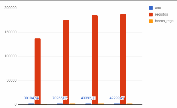
Thank you for your question. In your example, everything works as expected: series attached to the left and right axis are independent and they are rendered from the same base point, therefore they overlapp each other.

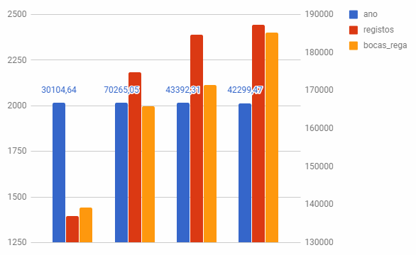
You said that you expect that green bars should be placed side-by-side to other bars. To do that, just remove right axis and place all series at left axis - the chart will render in a way you need. Hope it will help.

1 Like

Hi there @levko.

I don’t think that’s the correct behaviour a secondary y axis should have. Why would you want a data series to entirely cover up other data series?

The objective of a secondary y axis is to allow very different rangesof values to be plotted on the same graph.

For instance, on google sheets with the same data, when you go from 1 to 2 y axis’ you get:
image
1 y axis

image
2 y axis’

As you can see you get a better visualization into your data when using very different data ranges.

Hi @dncpax!

Now I better understand your problem. Currently it’s impossible to achieve behavior that you need, but I think it’s important feature. So can you please create an issue on GitHub so we can investigate the problem and try to find a solution for it? Thanks!

@levko created issue https://github.com/getredash/redash/issues/2292. Hope is ok

1 Like