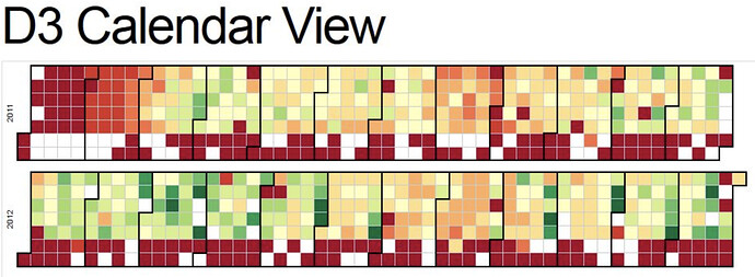
I would LOVE it if a calendar-type visualization was provided. (see below). Supersets has a visualization similar to this, and the absence of it in redash is really the only thing preventing me from migrating everything I’ve got to the Re:dash platform.
This site is in read only mode. Please continue to browse, but replying, likes,
and other actions are disabled for now.
We’re currently not adding new visualizations at least until #3493 is merged. But you might be able to accomplish something similar using the heatmap chart type. It won’t be as nice, but can still show the needed data.

