I am trying to create a cohort heat map using the built-in visualization.
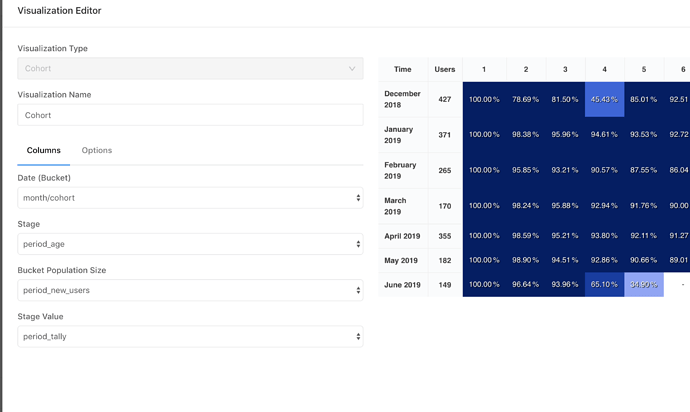
I think I have configured the right columns in the chart settings as instructed in redash knowledge base. I even calculate the percentage retention on my own.
However, in the chart, the percentage shown is different than mine. May I know what happened in this case? Here are the detailed pictures
There are two things I’ve notice here that might explain what’s going on:
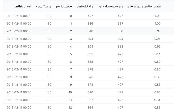
- The “Bucket Population Size” value needs to be the same for all rows of the same bucket. But in the screenshot above for the bucket of 2018-12-11 I see that it changes from row to row.
- It seems to be a monthly cohort, but your dates are for mid-month?
Can you share the query you used to generate the data?
I think I know what’s the problem. The cohort is month and the period is week.
The reason for changing bucket population size is because their are some old users are excluded in the new week to prevent the percentage going down because of the wrong base value.
My further question is: is there a way to directly plug in my retention percentages to the cohort graph? Or is there any workaround to make (month cohort, week period) possible?
Note that the mid month is just a trick to make the offset for the GMT time (all my month dates are at the 1st day of the month, I have added 10 days to it)
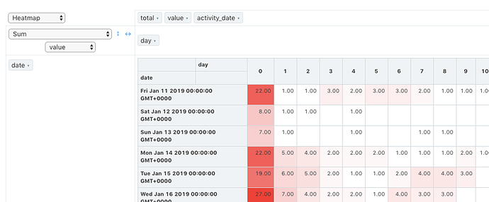
Currently there isn’t (although it’s a good idea). You should be able to create it with the Pivot Table visualization. Using a configuration similar to this one:
In your case replace date with month/cohort, day with period_age and value with average_retention_rate.
It’s not the prettiest, but will show the data…
But isn’t the idea to compare the same group over time?
That is a brilliant idea! I will go for the pivot table idea. Is there a conditional formatting setting that I can to show the gradient color?
Yes, but since a user can sign up in any of the four/five weeks in a month, let’s say we have: 50, 20, 30 and 100 new users in week 1,2,3,4 respectively. There are 200 users in total in that month. If we divide week2’s tally (let’s assume we have 40 users retained from week1) by total monthly users, that is (40+20)/200, this percentage isn’t what I want because the 130 users haven’t come yet. So that’s why I have to change population to 70 for week2
Unfortunately not. You can only enable the heatmap, but no control over the gradient.
Right, this makes perfect sense. 
Is there a way to get rid of the “total” in pivot table?
Not at the moment, but there will be once this Pull Request is merged and deployed. I will update here once it’s out.
@arikfr Is there also a way to change the gradient color scheme of the heatmap? even if it involves custom tweeking of the CSS code if I inspect the elements?
The gradient of the Pivot Table or Cohort?
The gradient of the pivot table, but will be interested to see if there is a way to change cohort as well
Any news on the gradient in pivot heatmap? Having an option to revert it would be very helpful already!
I haven’t seen any changes in this area for awhile 


