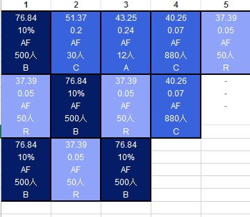
Can I create the cohort like below with redash?
(There are 5 numbers in one cell)
At the moment, no. Redash’s cohort visualizations are limited to displaying each sample as a percentage or “hit rate”. We intend to update the cohort visualization options in the foreseeable future, though, so I’m curious about your use case for this functionality. I haven’t seen a cohort that looks like this. Could you describe a bit more of how this projection of the data is useful to you?
I want to visualize complex data and make it possible to understand the shade of effect at a glance.