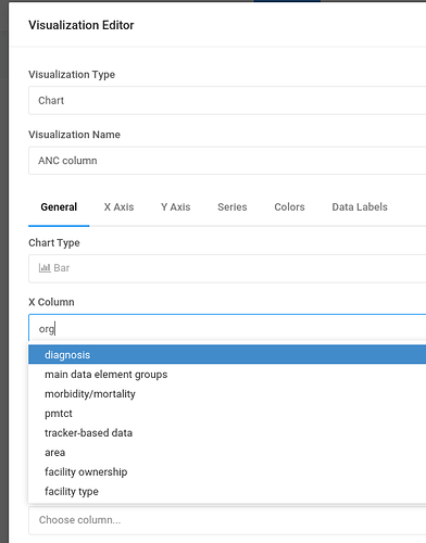
First thanks for an excellent product!
This suggestion is about “Visualization Editor” screen and filtering on the “column” related input fields (including X columns, Y columns, Group by, Errors column).
Currently when we filter for a column, the matching columns are highlighted. Now when you have a large number of columns (say 100), it is not very helpful, in particular since the columns are not ordered alphabetically, as you have to start scrolling down to find the columns.
I would suggest that when filtering, the drop-down should only display the matching columns and hide the non-matching. When the filter is cleared, all columns become visible.
This will improve usability greatly and make it easier to find columns when you have a large number of columns in a query, which is very often the case for complex data warehouses.
Thanks!
best regards,
Lars

