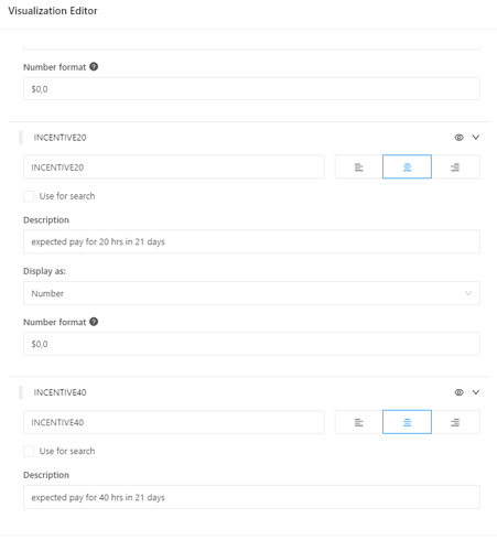
Here you can see when you edit a table visualization then expand all the columns.
It’s totally confusing, right? When you expand all your columns, keep scrolling up and down you need to add a bit of strain in your eye so you can focus on which column you are actually editing.
Hopefully, there is a better layout like adding tree view expansion, more space or indention, add colors or whatnot, but please help our eyes to have a better experience in editing.
THANK YOU! ![]()

