Hey, great job there !
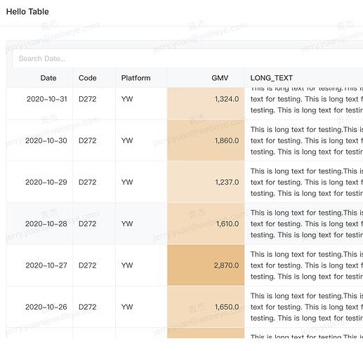
I have an idea while I’m using it. Since cohort and pivot table can both set color to some column so that user can easily see the exception or the trend of data, why not add it to our basic Table visualization. If we just want a simple table to hold data and can’t find a way to mark the colors, it could be a disappointment for users.
I already make it possible in my practical project and it seems well. Let me know if you’re interest ![]()
This site is in read only mode. Please continue to browse, but replying, likes,
and other actions are disabled for now.
I think this would be very helpful. We could output html as well but this would be cleaner.
Glad you like it ! I’ll work on a PR for it.
1 Like

