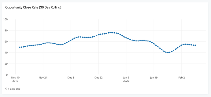
I wanted to poll how you guys feel about exposing more display options for Plotly charts.
For example, let’s say I want a line chart with markers for data points and spline smoothing:
Right now I can only do that using the “Custom” chart type, with a ton of Plotly rendering code:
var trace1 = {
  x: x,
  y: ys.r2,
  mode: 'lines+markers',
  line: {shape: 'spline'},
};

var data = [trace1];

var layout = {
  autosize: true,
  margin: { l: 10, r: 10, b: 10, t: 25, pad: 4 },
  width: Math.floor(element.offsetWidth),
  height: Math.floor(element.offsetHeight),
  xaxis: { automargin: true },
  yaxis: { automargin: true, range: [0, 100] },
  showlegend: false
};

var config = {
  responsive: true,
  displayModeBar: false
};

Plotly.newPlot(element, data, layout, config);
In this case, the only two relevant lines are:
mode: 'lines+markers',
line: {shape: 'spline'},
There are two questions that come to mind:
- Is this a level of customization Redash should allow to begin with, without doing what I did above and requiring a completely custom chart? (My opinion is obviously YES).
- What’s the best approach to allow this?
One approach could be to expose specific settings through the UI on a case-by-case basis: “Line Style” fo each series in a line chart that allows selections like “Line”, “Line with Markers” and also a checkbox for “Line Smoothing”.
Another approach would be allow people to pass in Plotly configuration code for each series that would override the generated configuration as-is. This approach would be much more powerful and flexible but also not as practical for people who are not familiar with Plotly and the options it has.
Thoughts?


 At least for the simple cases.
 I guess what you suggested – both adding new chart types and additional options is unavoidable.