Hello everyone, need some help with visualization setup. So the problem is that I need to make one with weekly registrations.
Made a query in mysql:
SELECT DATE_FORMAT(created_at,‘%M %Y’) , COUNT(id)
FROM users
GROUP BY WEEK(created_at)
ORDER BY WEEK(created_at)
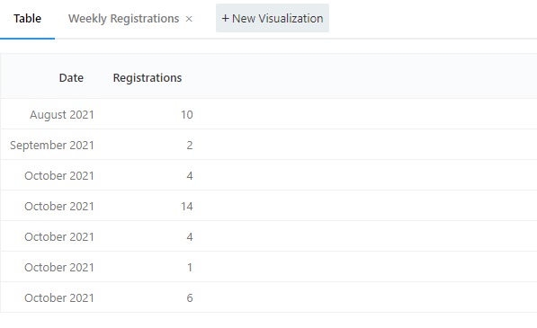
Table looks right:
But when I create a visualization it groups all by month
I don’t understand if the error is in query or in visualization.
In ideal it must be column X that reports month/year with 4 or 5 columns (weeks) and column Y reports numbers or registrations.
Something like that
The first issue is that your query returns multiple rows for each month:in your screenshot there are five samples for October 2021. Redash expects one row per x-axis sample. If it sees more records, it silently adds them together. Which is why you see monthly bars instead of weekly.
The second issue is that your date format (%M %Y) won’t sort correctly. Which is why October 2021 appears beforeSeptember 2021. I’d recommend using a query like this:
SELECT
  date(DATE_ADD(created_at, INTERVAL(1-DAYOFWEEK(created_at)) DAY)) week,
  COUNT(id) user_count
FROM users
GROUP BY 1
ORDER BY 1 DESC
LIMIT 52
Sorry for the confusion. I wrote my example using curdate() because I was using sample data.
I updated the example to use your column name.
Regarding your other question:
-- The following in MySQL

SELECT   DATE_ADD(created_at, INTERVAL(1-DAYOFWEEK(created_at)) DAY)

-- Imitates the following in postgres

SELECT date_trunc('week', created_at)
Oh! I didn’t recall that your created_at field is a datetime field. Notice that all the dates in your table result are exactly seven days offset from one another, but they retain the time component of the original created_at field. You can use the date() function to strip that away.
I updated my example.
-- Wrap in a date() call to cast to a date *without* the time component
SELECT   date(DATE_ADD(created_at, INTERVAL(1-DAYOFWEEK(created_at)) DAY))
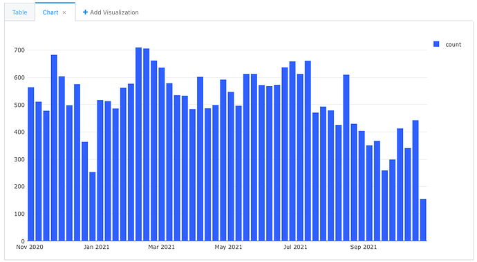
Everything works! Thank you so much. You’re a genius. If you don’t mind, I will ask the last question, how to make a month and a year on the X axis, as on your chart. I tried to change the chart settings by specifying MMMM YYYY in data labels-Date/Time Values Format and input to use datetime in X axis instead of auto detect, but it still comes out as in the picture below
The axis is formatted automatically. You can’t change it manually without modifying your query. But you’d have a problem either way because your data is more precise than by-month. At minimum you would need to show by Month + Week.