I have an issue with historical area charts with two given options for “Missing and NULL values”:
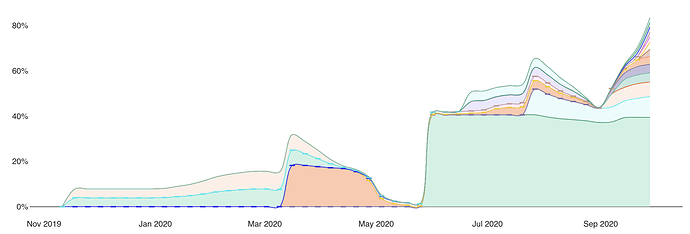
- Convert to 0 and display in chart
Shows ugly dashes for values that have a zero:
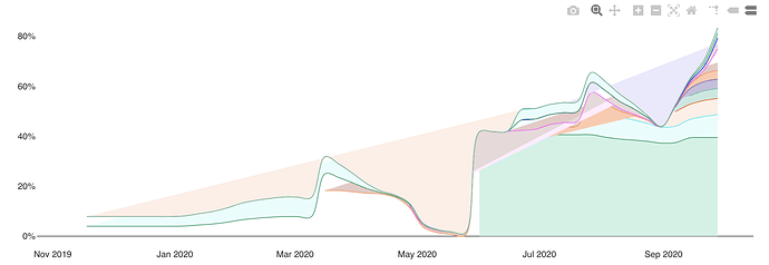
- Do not display in chart
Shows weird straight lines from the beginning to the first occurence of data:
Is there a way to show the values but hide the dashes? The existing options are quite ugly.


