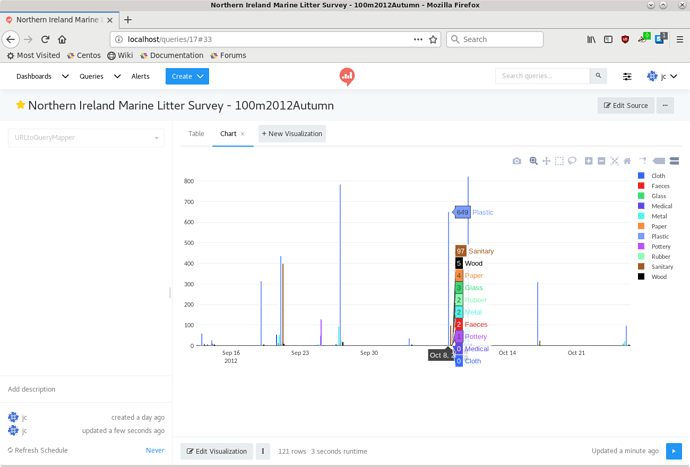
Found what seems like a bug in chart visualisations.
Being new to Redash though, I’m not sure. ![]()
[Apologies in advance, this will likely be a bit screenshot heavy.]
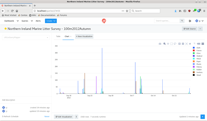
So, I’ve created a chart visualisation using the brand new “Redash JSON” export added to our DBHub.io service earlier today: ![]()
(data source here, json export url here)
At first glance, it seems ok. Looks like the grouping/stacking has autoarranged things decently.
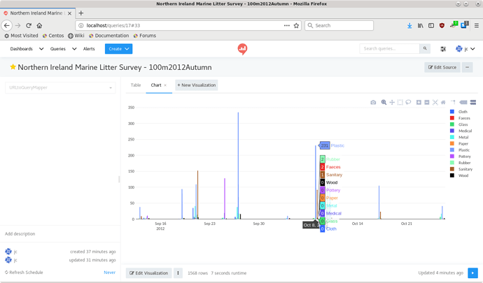
However, when hovering the mouse over the columns, the numbers displayed for any of the categories seem to be off. This one seems ok at first glance too, as “231” (top value in the hover) is in the ball park of what’s shown in the graph (blue “Plastic” entry).
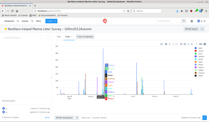
But this is clearly not correct:
The hover has “70” for the Plastic entry, whereas it should be 300+ going by the graph value.
Zooming in on the values for the group containing 231 shows this:
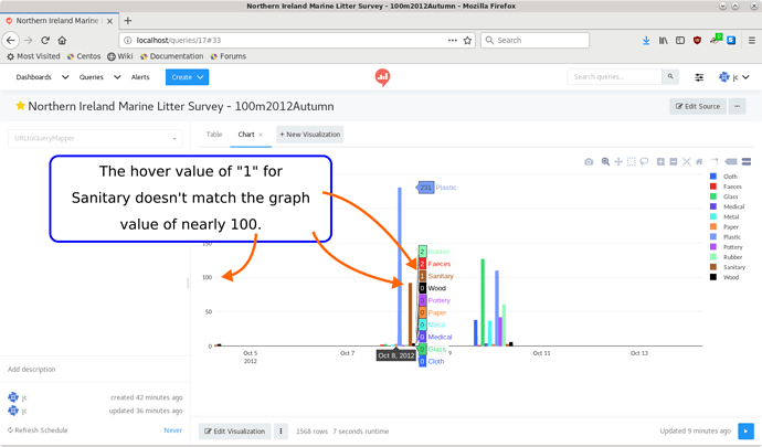
Yeah… that’s not correct. The brown entry “Sanitary” shows ~100 in the graph, but the hover shows “1”.
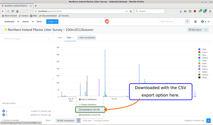
Investigating by downloading the data as CSV from the Redash download link…
The values from the date range:
...
2012-10-08,Plastic,0
2012-10-08,Plastic,0
2012-10-08,Plastic,231
2012-10-08,Sanitary,0
2012-10-08,Sanitary,92
2012-10-08,Sanitary,0
2012-10-08,Sanitary,4
2012-10-08,Sanitary,1
So… it seems like the graph values are aggregated, however the hover values seem to be picking a singular value from the data set. Something like sanitary[0] instead of sum(sanitary).
Alternatively, maybe I just need to change some options in the chart definition or SQL query and it’s not a bug? ![]()

 ). See previous discussion here:
