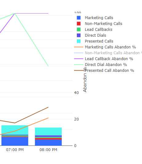
Couldn’t find anything in the search so before I post it as a bug wanted to see if this was a known issue. When there is a lot of data on a chart the legend tends to overlap the right y-axis covering the title and the values. Has anyone else experienced this before?
I Only can acknowledge the existence of this annoying ‘feature’.
Couldn’t find any help on this issue either.
Told my users to expand the screen when used, it makes it little bit more readable.
Hi,
I’m also experiencing this problem - its feels like such a basic piece of functionality that there must be a solution? Has anyone had any response on this?
Cheers,
Andy
This is a Plotly bug and not something Redash controls. The solution to widen the view port works because Plotly re-renders on <div> resize.
Not really. Plotly has had this bug for years (see the dozens of legend-overlap issues on their Github repo). Many talented developers tried. It’s not easy to solve.
One improvement we could implement is to allow arbitrary legend positions in visualization settings. Right now it’s automatic. This often breaks responsive layout. But maybe that’s a decision we could leave to the user.
Related:

