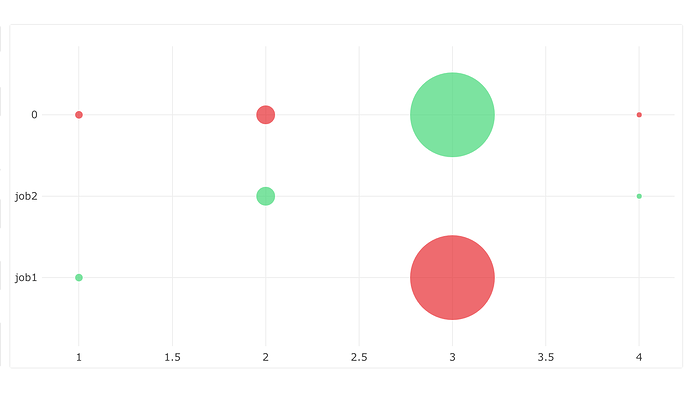
I’m trying to having a bubble chart showing success/failure of various server jobs through time.
My X axis is time. The best way I could find to have different colors for success and failure was to make them to separate series (from two separate columns in my query results). Bubble size is currently being set to job size.
The Y axis is category. So for example “job1”, or “job2”. Example data…
time,success,failure,size
1,job1,null,10
2,job2,null,23
3,null,job1,100
4,job2,null,7
Unfortunately, the nulls are being turned into categorical values (and actually showing as 0s). Which means there’s a y-axis row that has the INVERSE of all the successes/failures that were intended on all the other rows.
Am I coming at this wrong–is there another way I should be looking at creating two series in a bubble chart? Or a different approach to controlling color?
Anyone got any advice?

