I’m using Redash Version: 8.0.0+b32245 (a16f551e). When creating a Pie Chart, it works as expected, however for the column name value in “Y” axis appears above the pie chart verbatim and I was looking for a way to change that label at the top. Any help is greatly appreciated.
This site is in read only mode. Please continue to browse, but replying, likes,
and other actions are disabled for now.
Thanks for the quick reply.
In the example, I specified an alias “Column A” however it displays “column_a”, ideally it would just use my alias or like in table mode, I can change the display name for it.
Let me know if this has been unclear.
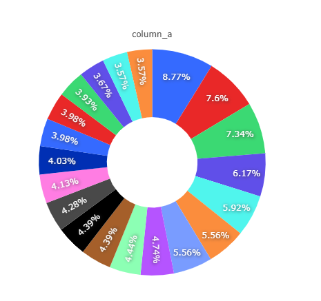
Here’s a full example, sorry I couldn’t share the original as it had our customer information in it.


Thank you! Yes, that’s a bug, I already submitted a fix - https://github.com/getredash/redash/pull/4775