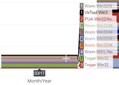
On a a stacked bar chart, is it possible to increase the length of the text that pops up when hovering over a band?
On the graphic below, you can see what I mean. It’s tough to tell what data is being represented by the band since many of the values begin with the same characters.