I seriously love this layout. My one suggestion (which I wrote about here) is to make the query description an expandable and markdown sensitive field. It should hold 200-300 words without issues. In this layout it would overflow and look strange, I think.
I like the direction! Although I feel I need to see it in a larger concept to firm a good opinion.
In the meantime, I want to add two things to consider when designing this:
When designing this, need to keep in mind the “data only view” for query results (#3087)… For example: in the query editor, description can be somewhat hidden, because it will be more prominent in the data only view, where it’s more important.
We are planning to move Query Snippets into the query editor, and for this been considering a tabbed view for the schema region. See previous discussion here: #2645.
The tabbed interface discussed in #2645 is similar in concept to what you suggest here. We just need to decide on what goes where and whether vertical tabs or horizontal ones.
My thought was that when toggling data only / edit source modes, the tab would automatically change accordingly to info / edit query.
The concept of the cards mentioned in #3087 has the benefit of freedom and future-proofness which I favor, but lacks in space usage efficiency. I’ll try to strike a balance.
The tabbed interface discussed in #2645
I think collapsing/expanding vertical content is better than horizontal tabs here cause:
a) When adding a parameter it’s important to have that section visible. We can auto-expand and scroll to section when needed.
b) Horizontal tabs are limited in terms of visibility. The 3rd and above would be obscured and I’m always thinking of German l18n in the future
Currently the source/data only views are two views of the same page. But I think we should look beyond that. Those are two different concerns, usually serving different use cases and many times different users. Therefore each should be designed to best serve its use cases.
I like the direction this is going. It crossed my mind to suggest that we eliminate the header (where it says “Query title” at the moment) entirely, but realized that this is where the tab bar will be, when we introduce tabbed query editor
I would consider removing the top nav bar though, and replacing it with a Redash logo to the left of the query title which takes you back to the rest of Redash. But maybe we should keep this to a future iteration.
The reason I favor exposing all visualizations is cause I see no reason for them to be obscured by tabs. It would actually hinder deliberation as I see it.
The problem with it though is that it would be harder to refer someone to a specific visualization. Perhaps that can be worked around with a simple anchor in the url.
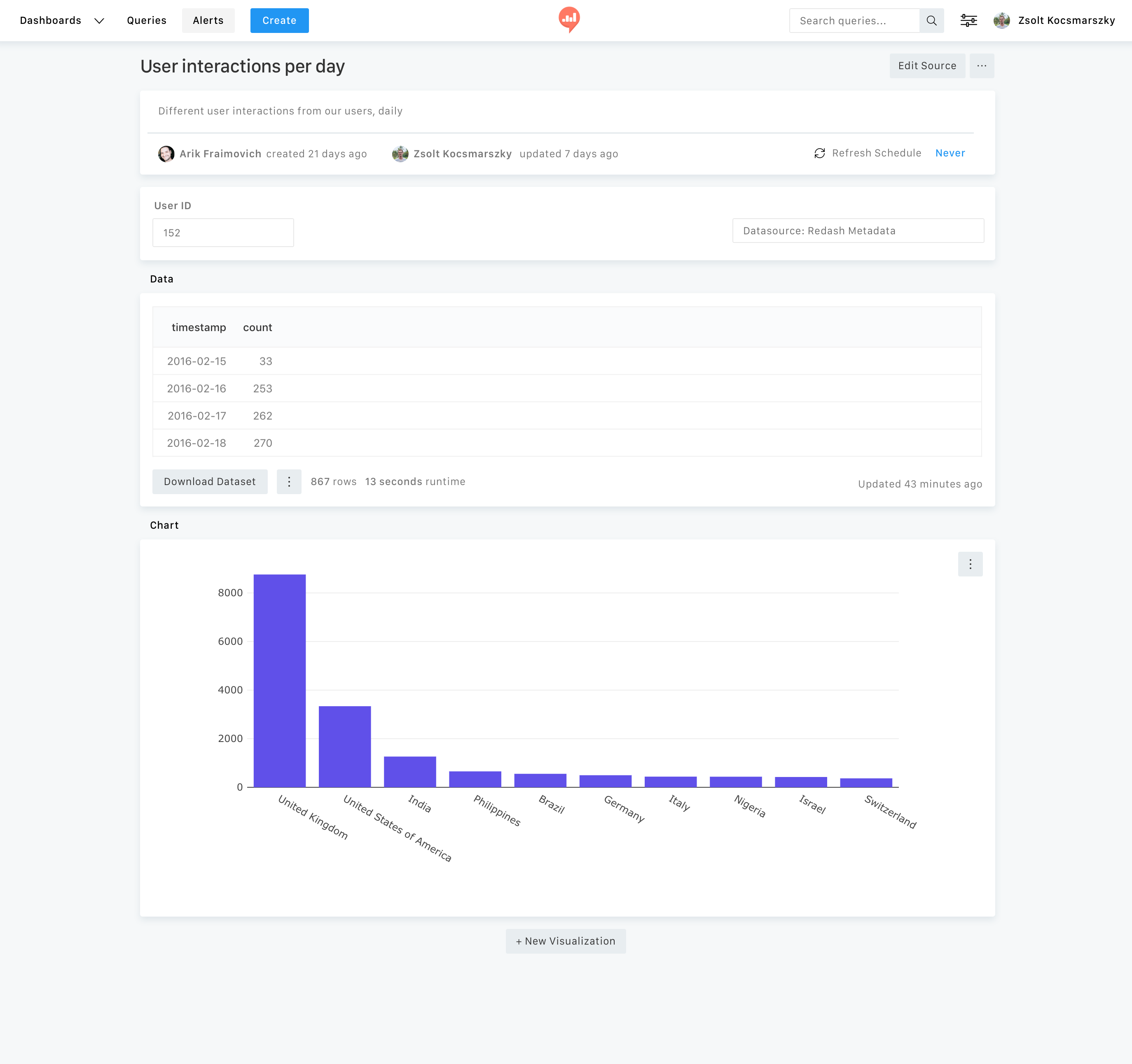
I’ve been exploring a design concept I’d like to get your opinion on.
I wanted to give this view a “report” look - clean, concise and with focused attention.
Yes the header part is quite large but my intention is that if the chart area falls behind a certain height, the page would be scrollable. Or perhaps scrollable by default instead of fixed.
If we decide to go with this, I’ll continue with including:
It’s worth exploring this with a few “edge cases” – for example, what will happen if there are no tags or description? It will be weird to have all that white space and the “metadata” on the right.
Also worth seeing a version with an “owner” (someone who can edit this) and non-owner.
As there is a Redash logo there, is this supposed to be the whole page without the navbar?
Great! I’ll give a min-height to visualizations so short ones don’t look weird.
worth exploring this with a few “edge cases”
Coming soon
Also worth seeing a version with an “owner”
My tendency is to ditch the ability to edit stuff on this page, for the sake of simplicity. All edit options are available in the source edit view anyway. Wdyt?
I don’t know. We didn’t have this in the past, but people asked for it. And in a way it makes sense. Think of this scenario:
You’re viewing a dashboard and noticing something you want to fix in a visualization.
You click on the widget -> get to the data view.
You now need to do another click for source view, instead of being to directly click on Edit.
I think this flow was frustrating or confusing people. I remember many support questions about how to add/edit visualizations in the past.
I think it will be nice to have this view, but it shouldn’t be the default. Unlike the Query Editor, where we want to give the editor/data as much screen real estate as possible + it’s a “realm” of its own, you get to data pages from various places in the app (mostly following a widget in a dashboard). I think it will be disorienting to loose the navbar at this point.


 to everything about vertical tabs and icons.