This works for me (just showing the date) on a bar chart, but not on a line chart. I’ve made sure I’m returning a date field, not a text field, but no matter what combination of things i’ve tried, no joy for a line chart. Did you ever find a resolution for this? Thanks!
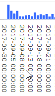
Sure. I’d be thrilled to find out what I’ve done wrong. I’ve tried it with different functions and different specifications for the x axis scale. image|690x370
I also found that it’s not that the bar chart was working for me, it’s just when it’s sized smaller and collapses I don’t see the times…when it’s expanded I see them again.
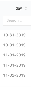
The issue is that date_trunc returns the time as well. You need to explicitly tell your database how to format the timestamp. It looks like you’re using Postgres so you can do that with to_char. Notice that in my example below I added an extra space to the format string to prevent Plotly for parsing it as a date.
Before
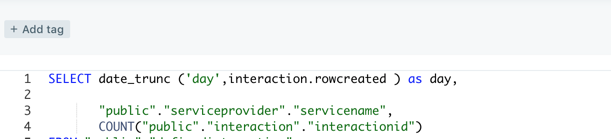
SELECT date_trunc('day', users.created_at) "day", count(*)
FROM users
GROUP BY date_trunc('day', users.created_at)
ORDER BY date_trunc('day', users.created_at) DESC
LIMIT 25
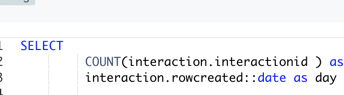
SELECT to_char(date_trunc('day', users.created_at), 'yyyy-mm-dd ') "day", count(*)
FROM users
GROUP BY to_char(date_trunc('day', users.created_at), 'yyyy-mm-dd ')
ORDER BY to_char(date_trunc('day', users.created_at), 'yyyy-mm-dd ') DESC
LIMIT 25


