Hey,
I am self-hosting the redash and would like to style it in a particular way.
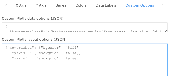
I would for example like to:
- Remove horizontal and vertical grid lines from charts.
- Add a background logo (watermark) to the charts.
- Rounded bars in the bar chart + padding between bars
- Smoothen the line / area chart borders
I’m ready to delve deeper into the code. Is there a way to control this via viz-lib’s visualization settings for example? Any pointers to the correct place in the code?
I’m running redash v8.
Best,
Robert