Hello, sorry to disturb you.
Could you please advise is there anything wrong with my operations?
I chose the datatype to be datatime, but it doesnt work.
jesse
March 24, 2020, 4:39pm
2
The axis type is Date -time. Not time only. Append dates to your times and the chart can display:
Thanks very much. It appeared afer I added the date infor.
But it works fine for scatter points graph. However, the line graph still can not show properly.
jesse
March 25, 2020, 3:58pm
4
How do you expect the line to appear? What do you see instead?
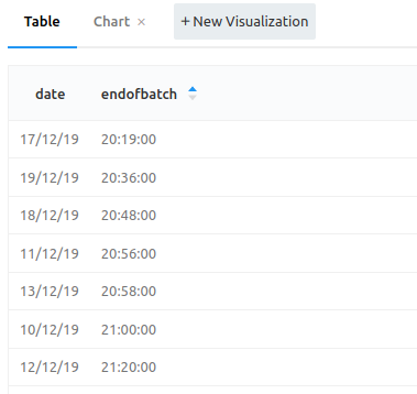
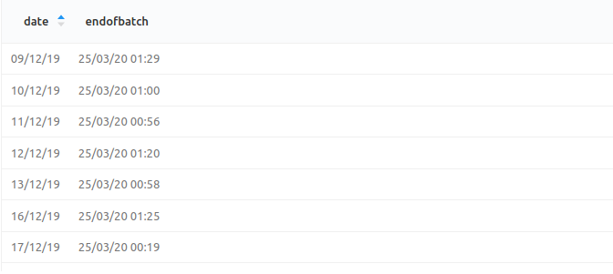
Thanks for your prompt reply. Sorry that I forgot to add the pics there.
Here’s the scatter graph:
Here’s the line graph:
I expect that the line graph should just connect the scatters in the second one.
Thanks in advance.
I know that’s an old topic, but was anyone able to add TIME (Hours:Minutes:Seconds) as Y axis?
jesse
April 7, 2022, 1:43pm
7
Redash is a community project. We’re happy to review a pull request implementing this behaviour.
Meanwhile the only workaround is to pass a full date-time, which Plotly understands by default.