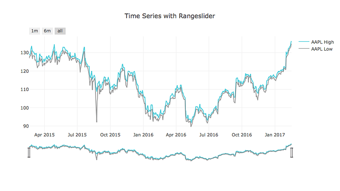
Couldn’t find any other posts on this, but would it be possible to toggle the Range Slider and Time Scale Buttons for Chart visualizations that use DateTime for the x-axis?
It would be nice to customize the Time Scale Buttons when they are toggled as well.
It may be worthwhile to create a different visualization called “Time Series” as the UI might be a bit different than the catch-all for “Chart” visualizations.
See example from Plot.ly’s website:

