Working on Alerts feature breakdown Aug '19 - #5 by ranbena I attempted to eliminate the Alert Name field as it is redundant if swapped for the “edit-in-place” component, already implemented in Dashboard and Query pages.
While it’s consistent with the other pages, it doesn’t look clickable much (we might have the same problem on dashboards/queries, but we are just used to it). Not sure this is a pattern we need to keep. Or at least we need to have some visual cue that this is the case when in edit mode.
So, let’s discuss it. Here’s how the feature works:
Personally, I like edit-in-place cause it doesn’t take up space. It does only when in edit mode.
Google Docs does it the same way and probably for the same reason.
The disadvantage is that you don’t know the title is editable till you hover it and get the yellow indication.
To address the clarity problem, I thought of maybe adding a small edit (pencil) button but I don’t like how it looks and for Dashboards it can get too crowded.
One solution is to make all editable pages have view/edit modes.
In view mode - title is non-editable.
In edit mode - title has clear editable indication (textfield around it, or yellow bg, etc.).
It actually already works like that for Dashboards (title non-editable till dashboard is in edit mode).
For Alert we can do the same - we’re planning a view only mode anyway.
That would mean we need a view only mode for Query page.
To address the clarity problem, I thought of maybe adding a small edit (pencil) button but I don’t like how it looks and for Dashboards it can get too crowded.
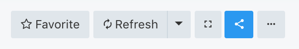
Maybe this button can escape icon-mania, if it takes the ’s place.
Then, it would have a consistent location amongst all editable title pages.
I don’t think we need it when editing. So the pencil can take its place, otherwise I wouldn’t move the Favorite control anywhere.
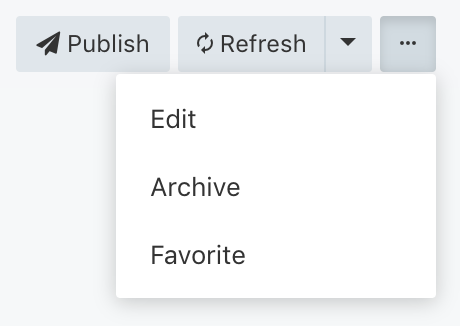
We can also remove the publish status and user’s avatar in edit mode to better signal something happened. I would also consider putting a border around the title to signal it’s editable.
(we might have the same problem on dashboards/queries, but we are just used to it). Not sure this is a pattern we need to keep. Or at least we need to have some visual cue that this is the case when in edit mode.