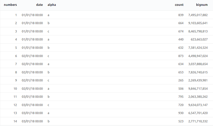
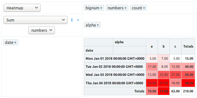
I;m trying to find documentation or examples of how to use the heat map feature of pivot table. For many/most of the other formats (e.g. sunburst) there’s some documentation about how to format the data to make use of the visualization, but not so with the heat map. Google doesn’t turn up anything either. Does anybody have some examples and/or descriptions of how the data should be formatted?
This site is in read only mode. Please continue to browse, but replying, likes,
and other actions are disabled for now.
Hi. Is there is a way to change the gradient color scheme of the heatmap? One-time change by changing the code of the front end is also fine
1 Like


