I’m trying to embed a line chart visualization in a pretty small IFrame (233ₚₓ x 90ₚₓ). It doesn’t seem to work well, as it doesn’t fit:
Ignore the blue hue/gradient, just experimenting a bit.
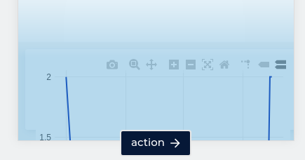
Is there any way to make the chart fit within these dimensions? I’ve enabled FEATURE_ALLOW_CUSTOM_JS_VISUALIZATIONS on the Redash instance, so if there’s anything I should mark there to make it fit, that’s an option as well.
Update:
It also seems like when using Redash dashboards, the visualization does respond nicely:
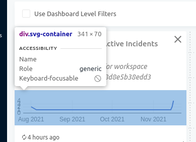
What’s the difference between adding a visualization widget in a dashboard and embedding it in my own UI that’s causing this discrepancy and how can I overcome it?