Hi.
I have problem with “Chart”. When using a hierarchy, a bug occurs. Example:
select (10.5) as res , ‘T’ as types, ‘A’ as types_main
union all
select (12.5) as res, ‘D’ as types, ‘A’ as types_main
union all
select (13.5) as res, ‘B’ as types, ‘A’ as types_main
union all
select (11.5) as res, ‘D’ as types, ‘B’ as types_main
union all
select (12.5) as res, ‘B’ as types, ‘B’ as types_main

% of the group was calculated correctly, but the label took only the last number of the group instead of the amount.

Hi @Gkirck! Can you please show a screenshot of visualization settings (General tab)? Thanks!

Thank you. I requested that screenshot to check the Group by option. Chart visualization does not do any sort of aggregation, so please ensure that you have the only Y value for each X (in your example dataset there are duplicates).

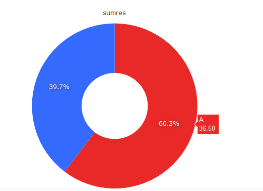
Hey @levko, I think Plotly ought to do this aggregation automatically. Given the same data shared by OP, when I plug it into Plotly studio, then it shows the same percentage. But the hover text reflects the correct sum.

image

Here’s the plotly state that makes this work:

{
  "data": [
    {
      "hole": 0,
      "meta": {
        "columnNames": {
          "labels": "C",
          "values": "A"
        }
      },
      "mode": "markers",
      "pull": 0,
      "sort": true,
      "type": "pie",
      "title": {
        "text": ""
      },
      "domain": {
        "x": [
          0,
          1
        ],
        "y": [
          0,
          1
        ]
      },
      "marker": {
        "line": {
          "width": 0
        }
      },
      "opacity": 1,
      "visible": true,
      "rotation": 0,
      "textfont": {
        "size": 12,
        "color": "#2a3f5f",
        "family": "\"Open Sans\", verdana, arial, sans-serif"
      },
      "textinfo": "percent",
      "direction": "counterclockwise",
      "hoverinfo": "label+text+value+percent",
      "hovertext": "",
      "labelssrc": "susodapop:0:b2d6bf",
      "labels": [
        "A",
        "A",
        "A",
        "B",
        "B"
      ],
      "valuessrc": "susodapop:0:0f93fe",
      "values": [
        "10.50",
        "12.50",
        "13.50",
        "11.50",
        "12.50"
      ],
      "automargin": false,
      "hoverlabel": {
        "font": {
          "size": 13,
          "family": "Arial, sans-serif"
        },
        "align": "auto",
        "namelength": 15
      },
      "scalegroup": "",
      "showlegend": true,
      "legendgroup": "",
      "textposition": "auto",
      "texttemplate": "",
      "hovertemplate": "",
      "insidetextfont": {
        "size": 12,
        "family": "\"Open Sans\", verdana, arial, sans-serif"
      },
      "outsidetextfont": {
        "size": 12,
        "color": "#2a3f5f",
        "family": "\"Open Sans\", verdana, arial, sans-serif"
      }
    }
  ],
  "layout": {
    "xaxis": {
      "range": [
        -1,
        6
      ],
      "autorange": true
    },
    "yaxis": {
      "range": [
        -1,
        4
      ],
      "autorange": true
    },
    "legend": {
      "x": 1.02,
      "y": 1,
      "font": {
        "size": 12,
        "color": "#2a3f5f",
        "family": "\"Open Sans\", verdana, arial, sans-serif"
      },
      "valign": "middle",
      "bgcolor": "white",
      "xanchor": "left",
      "yanchor": "auto",
      "itemclick": "toggle",
      "itemsizing": "trace",
      "traceorder": "normal",
      "bordercolor": "#444",
      "borderwidth": 0,
      "orientation": "v",
      "itemdoubleclick": "toggleothers"
    },
    "autosize": true,
    "hovermode": "closest",
    "showlegend": true
  }
}

It makes me wonder what we do to the data that prevents this from happening automatically?

Actually, having talked with @levko separately, the issue here isn’t Plotly’s default behavior. It’s that Plotly does the percent calculation, but Redash generates the data label. This is why we have a whole tab in the Chart Visualization Settings for changing the data labels. Since we do this behavior manually, we can’t rely on the default plotly behavior.

As such, @levko’s guidance above is mine also: you should aggregate your data in the query so that the chart reflects the desired sum. For example.

with base as (
SELECT * FROM ( VALUES
(10.5, 'T', 'A'),
(12.5, 'D', 'A'),
(13.5, 'B', 'A'),
(11.5, 'D', 'B'),
(12.5, 'B', 'B')) data(res, types, types_main))

SELECT types_main, sum(res) "sumres" FROM base GROUP BY 1

image

Thank you for your reply. I wanted to get all the necessary visualizations from one data pool, but apparently I would have to make additional requests.